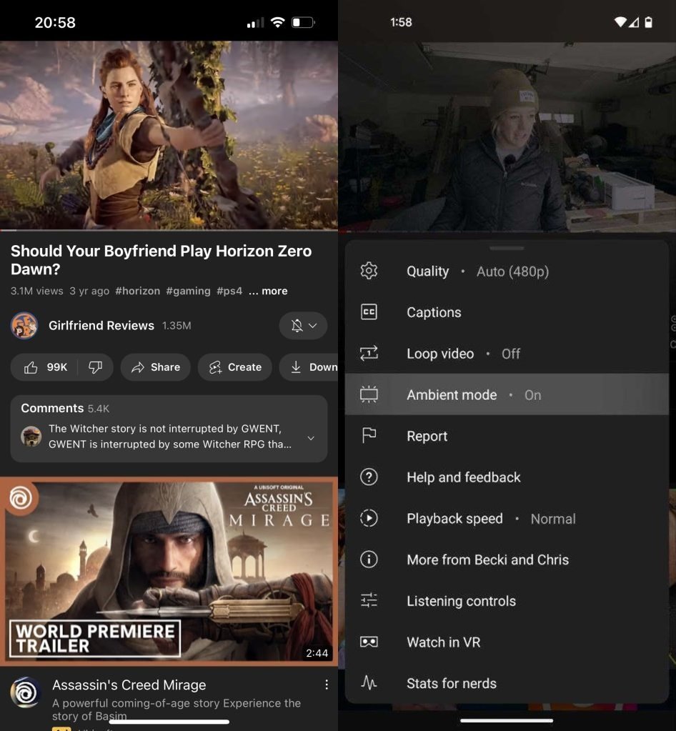
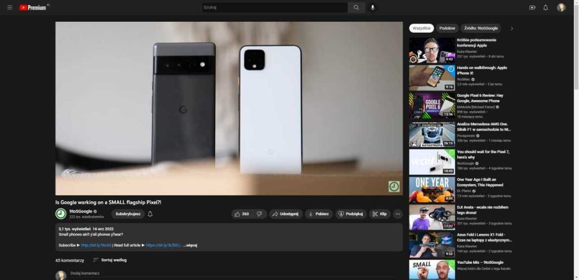
Popular video platform YouTube continues to receive significant design changes for its mobile and web version. The new design affecting the video page will make the interface look much more stylish and useful. Pill-shaped resizing of boxes and “Ambience Mode” draw attention.
YouTube video page switches to pill design
YouTube in recent weeks; It has gone through several design changes for Android, iOS and web version. The platform, which previously updated the Shorts section, has now overhauled the video page. In the new design, we see that the boxes are shaped into pills, the like/dislike buttons are combined, and the comments come to the fore.

According to YouTube’s new page design, the name of the channel will now be placed between the title of the video and interactable buttons such as like/dislike. Just below the slider buttons, the most popular comment will be highlighted.
The new video page design, which is stated to be distributed for Android, iOS and web, also draws attention to the “Ambience Mode” feature. Thanks to this mode, the general colors of the video dominate the home page design and a much more elegant interface is obtained.
The redesigned pill buttons also have their own background color, regardless of light or dark mode. YouTube emphasizes that the buttons will be much more stylish and useful this way. The new design also makes the description part of the video much more obvious.

The video page, designed from the ground up by YouTube, is now globally distributed. If you have not seen the new design in the mobile application or web version, an update will be shared in a few days.
What do you think about the new YouTube video page? Don’t forget to share your thoughts with us in the comments section!