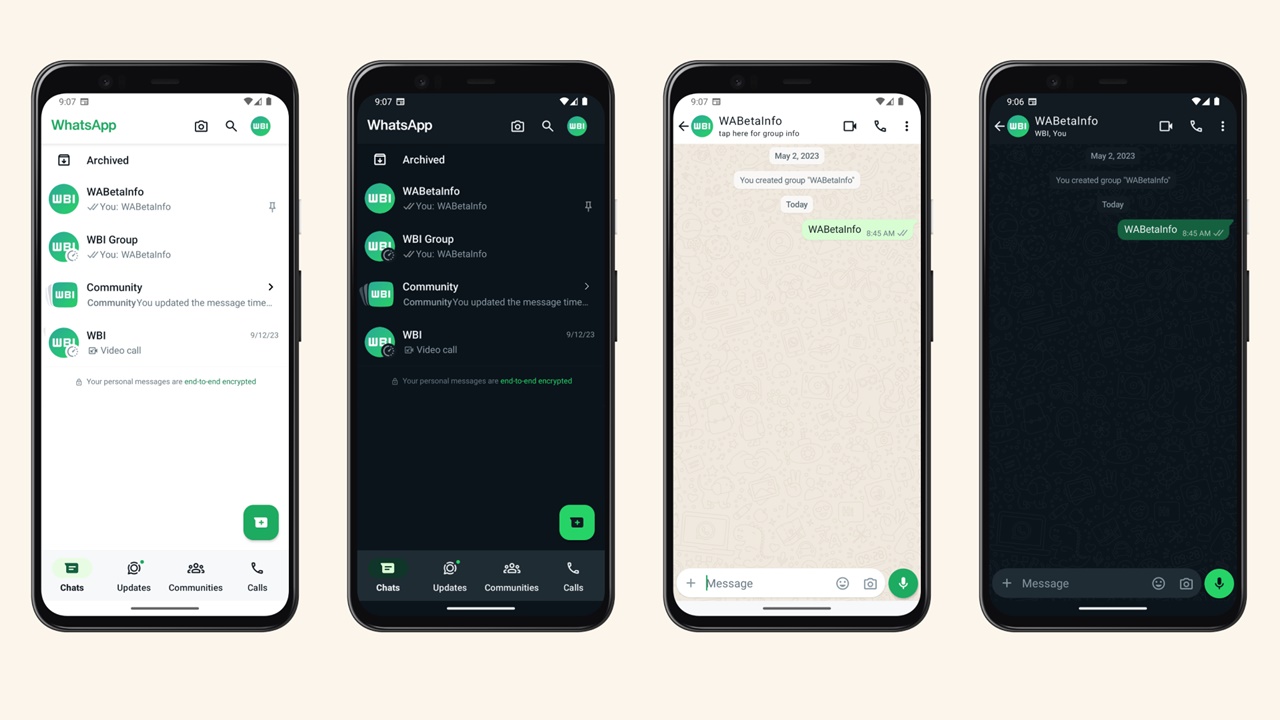
WhatsApp decided to combine the interface changes that it has been testing in parts for a while. Accordingly, the application is getting ready to change completely. So what does the new WhatsApp interface, first tested for Android, look like?
This is what WhatsApp will now look like on Android
WhatsApp has officially started implementing the most important design changes in recent years. The redesigned user interface was released to a limited number of beta testers. The first screenshots from the tests carried out for Android have also arrived.

According to the screenshots, WhatsApp; It will get new icons and theme color. The green-heavy theme also includes revamped chat bubbles. The redesign aims to deliver a more modern and visually appealing experience for users.
WhatsApp will now display Camera, Search and profile photo in the upper right corner on the home page. In addition, the WhatsApp text will have a modern look and will be presented in a combination of white and green. On the chat screen, the bubbles will be more rounded.
On the other hand, with the design change, it will be easier for users to quickly find their favorite content creators and status updates. A new search function will be available via the magnifying glass icon at the top right of the page.

Tests conducted on the WhatsApp Business Beta app for Android appear to be in line with Google’s Material Design 3 guidelines. The changes will be gradually rolled out more widely to beta users in the coming weeks.
So what do you think about this issue? You can share your opinions with us in the Comments section below.