Today, as we step into the digital age, many companies, especially automobile companies, are changing their logos. Brands, which started to sign more plain logos in accordance with the digital age, are abandoning three-dimensional logos and signing two-dimensional emblems. The last example of this came from Opel.
Opel’s new logo reflects the brand’s electric future
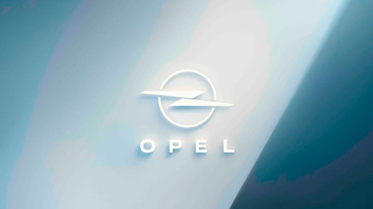
With a promotion, the German automaker revealed the logo that it will use from 2024. Bringing a new interpretation to the iconic ‘Blitz’ (Lightning) logo, Opel will soon start using this logo on all its models.

While the number of electric cars is increasing day by day, Opel’s ‘Blitz’ emblem has also become more meaningful. Symbolizing the company’s era of electromobility, the new logo will also be an important symbol in the brand’s transition to an all-electric car.
Unlike previous logos, Opel’s horizontally positioned lightning emblem appears with a two-piece design. With its new form, the logo better conveys the perception of electricity to us. In addition, the new lightning emblem seems to protrude more from the circle that surrounds it with the change of design.
Opel plans to start using its new logo with the vehicles that will come off the production line in 2024. But we won’t have to wait until 2024 to see the new logo on a car. Opel CEO Florian Huettl announced that they will exhibit vehicles bearing their new logo at the IAA Mobility fair.

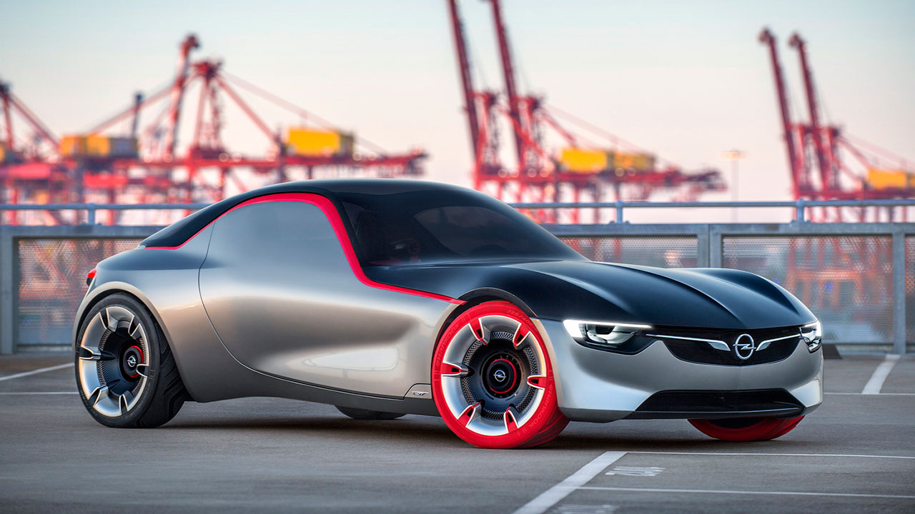
Huettl also added that they are preparing a surprise for this fair. Expressing that they will have a surprise that will excite the visitors, Opel CEO refrained from giving more details. After this announcement, we can expect an electric sports car concept from Opel at the IAA Mobility fair.
Opel keeps up with the changing automotive industry with its new logo. So what do you think about Opel and the new logo design? You can share your views with us in the comments section.